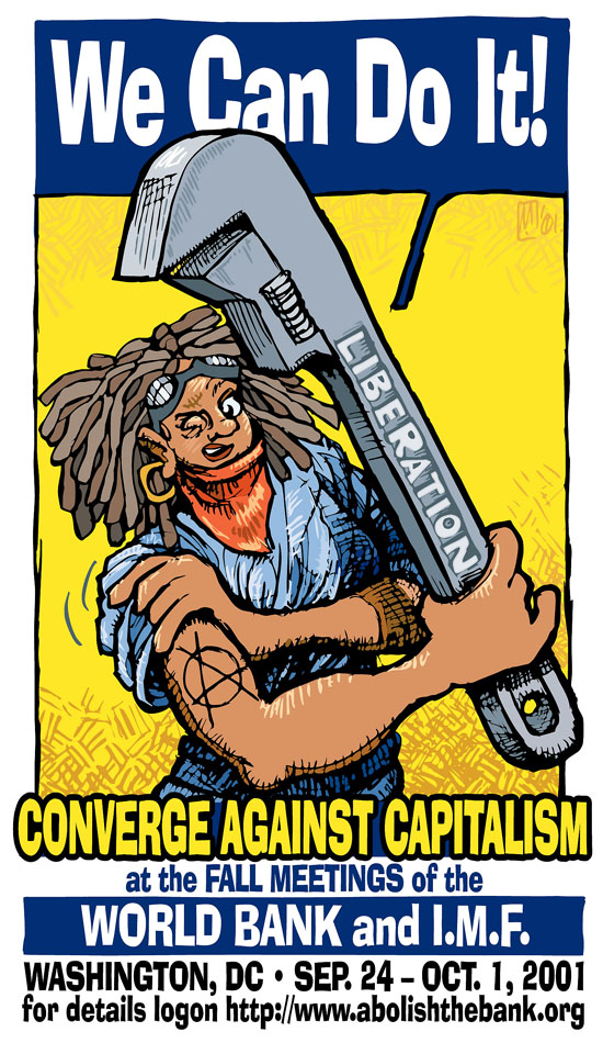
On the purely non-issue-oriented side, a design and technical epic Win. The layout, pose and color came out a perfect match -- I was able to find a high-res scan of the original WWII piece to point-sample my colors from -- and it was also the first time I made serious use of top-highlight and middletone shadow hatching effects, drawn on a sheet of tracing paper with a dark graphite stick, scanned as a separate layer and dropped over the main drawing in Illustrator. I'd been kicking the idea around for a while, playing with it just a bit, but decided to try it whole hog after seeing Van Gogh's La Meridienne at the Musèe d'Orsay a few months before.
High-res jpg image, 1.8mb


